
November 30, 2023
Data in pictures - a simple introduction to matplotlib
Purpose
This article will introduce readers to matplotlib, a versatile library for plotting data on visual graphs.
Audience
This article will appeal to newbies, learners and anyone interest in representing data in a graphical way using the world's favourite programming language.
Prerequisites
- install matplotlib - see for instructions for your operating system
- install numpy - most package managers like pip will automatically numpy when you install matplotlib. See if you still need to install numpy.
- ability to run Python programs on your machine - see my
Introduction
Whether a politician frantically quotes them on the media, or a friend conjures them up to justify their life choices, statistics are, better or worse, a part of lives. There is so much data out there, so many statistics, and they would be impossible to grasp without visualization.
Data visualization is a way of showing data in a graphical way. Data visualization transforms long, often laborious numbers into pictures that our human brains can process. As software engineers, it is crucial to understand how to represent data.
Fortunately for us, Python has an amazing, open-source library for doing that - matplotlib.
Step-by-step
Import matplotlib
Matplotlib is not part of core Python, so you'll need to import it into every .py file that needs it. Now that you have installed matplotlib.
- create a file called plot.py and import matplotlib as follows:
- we also need to import numpy, a Python library for working with large data structures. Numpy is a crucial tool for data science and statistics.
import matplotlib.pyplot as plt
import numpy as np
'pyplot' is sub-library that is a key part of matplotlib.
Create some data
Take your mind back to school where a younger you might have learned about plotting data on a Cartesian plane. We have an X (horizontal) and a Y (vertical) axis such as this:
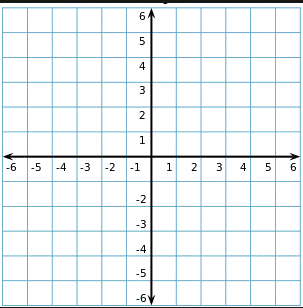
Before we can plot anything, we need some data. Let's create two simple lists, one to hold X values, and one to hold those for Y. We will use some sample data representing the Tokyo metropolitan area's population over the last fifty years.
import matplotlib.pyplot as plt
import numpy as np

x_points = [np.datetime64('1950-12-31'), np.datetime64('1960-12-31'), np.datetime64('1970-12-31'), np.datetime64('1980-12-31'), np.datetime64('1990-12-31'),  np.datetime64('2000-12-31'),   np.datetime64('2010-12-31'),  np.datetime64('2020-12-31')]
y_points = [ 11275000, 16679000, 23298000, 28549000, 32530000, 34450000, 36860000, 37393000]
Our X-axis will represent dates and the Y-axis will have population numbers.
You will note that we use numpy's 'datetime64' function to convert strings representing a date into datetime64 objects. This makes them more useful for plotting on a graph.
Plot the data on a graph
Long lists of numbers are not reader-friendly, so let's throw it up on a graph.
pyplot's 'plot' function receives, among other things, two arguments, a list containing X values, and a list with the numbers for Y. The function then, all things going well, creates a nice little plot for us. show() paints the graph in window.
plt.plot(x_points, y_points)
plt.show()- save and run your program. If all goes well, you should see a graph such as below.
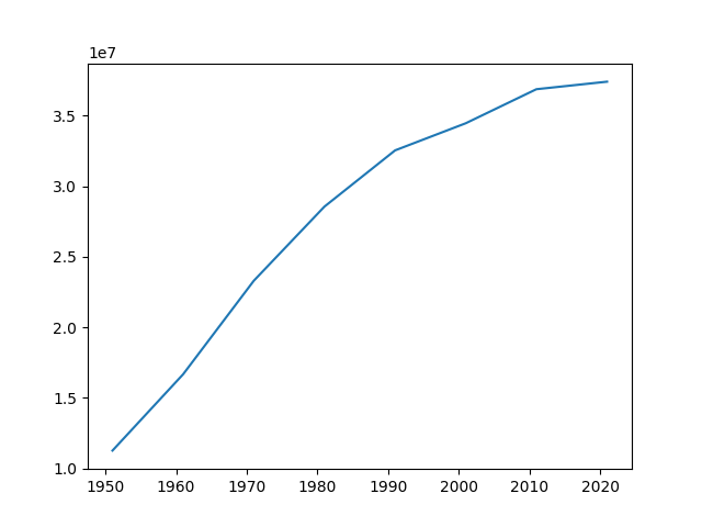
The graph shows a curving line, increasing steadily from 1950 until about 1990 where the rate of growth slows before flattening after 2010.
We can make each year's population more clear by using matplotlib's plot_date function.
import matplotlib.pyplot as plt
import numpy as np

x_points = [np.datetime64('1950-12-31'), np.datetime64('1960-12-31'), np.datetime64('1970-12-31'), np.datetime64('1980-12-31'), np.datetime64('1990-12-31'),  np.datetime64('2000-12-31'),   np.datetime64('2010-12-31'),  np.datetime64('2020-12-31')]
y_points = [ 11275000, 16679000, 23298000, 28549000, 32530000, 34450000, 36860000, 37393000]

plt.plot(x_points, y_points)
plt.plot_date(x_points, y_points, xdate=True, ydate=False)
plt.show()
The result:
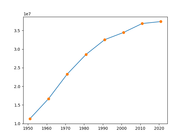
We can show two different plots on the same graph. Very cool!
Label each axis
- let's make the graph clearer by labelling each axis - add these lines
plt.xlabel("Year")
plt.ylabel("Population")- make it better by adding a title
plt.title("Tokyo Metropolitan Area Population")Your completed code should look as below
import matplotlib.pyplot as plt
import numpy as np

x_points = [np.datetime64('1950-12-31'), np.datetime64('1960-12-31'), np.datetime64('1970-12-31'), np.datetime64('1980-12-31'), np.datetime64('1990-12-31'),  np.datetime64('2000-12-31'),   np.datetime64('2010-12-31'),  np.datetime64('2020-12-31')]
y_points = [ 11275000, 16679000, 23298000, 28549000, 32530000, 34450000, 36860000, 37393000]

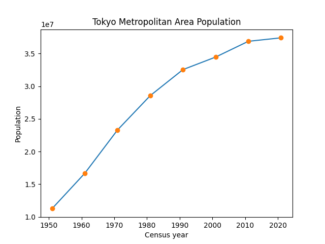
plt.xlabel("Census year")
plt.ylabel("Population Millions")
plt.title("Tokyo Metropolitan Area Population")

plt.plot(x_points, y_points)
plt.plot_date(x_points, y_points, xdate=True, ydate=False)
plt.show()- Save and run:
Re-calibrate the Y-axis
I'm loving the graph, but I'm not too keen on the Y-axis. Each interval has a number such as 1.5, or 3.0. At the top of the Y-axis, you'll notice '1e7'. This means the numbers are in scientific notation. e.g., 36860000 = 3.6e7
If you are a mathematician, a data scientist, or you just nuts for numbers, this is fine.
But let's make this easier to read for any audience. Matplotlib allows us format the numbers on the 'ticks' (small lines on the axis). Below is an updated version of the program.
import matplotlib.pyplot as plt
from matplotlib.ticker import FuncFormatter
import numpy as np

def millions(x, pos):
    return '%1.fM' % (x * 1e-6)

fig, ax = plt.subplots()

formatter = FuncFormatter(millions)
ax.yaxis.set_major_formatter(formatter)

x_points = [np.datetime64('1950-12-31'), np.datetime64('1960-12-31'), np.datetime64('1970-12-31'), np.datetime64('1980-12-31'), np.datetime64('1990-12-31'),  np.datetime64('2000-12-31'),   np.datetime64('2010-12-31'),  np.datetime64('2020-12-31')]
y_points = [ 11275000, 16679000, 23298000, 28549000, 32530000, 34450000, 36860000, 37393000]

plt.xlabel("Year")
plt.ylabel("Population Millions")
plt.title("Tokyo Metropolitan Area Population")

ax.plot(x_points, y_points)
ax.plot_date(x_points, y_points, xdate=True, ydate=False)
plt.show()
If we run this:
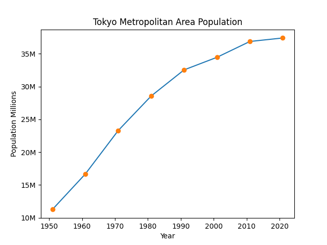
That looks much better. A lot has happened here, let's go over it.
We first import FuncFormatter - this allows us to define custom formatters for our ticks.
Next we define a function called 'millions'. This function takes the value x, converts it from millions to units, and then formats it to be displayed with one decimal place and the unit "million". This ensures that the values on the y-axis are displayed in a user-friendly format, avoiding scientific notation and presenting the numbers in millions.
After that, it's a matter of creating a Function Formatter object, passing out 'millions' function as an argument to it, and then setting that as our formatter for the y-axis.
Next steps
1k views
