October 10, 2024
How to Create an HTML Image Gallery with Minimal Code?
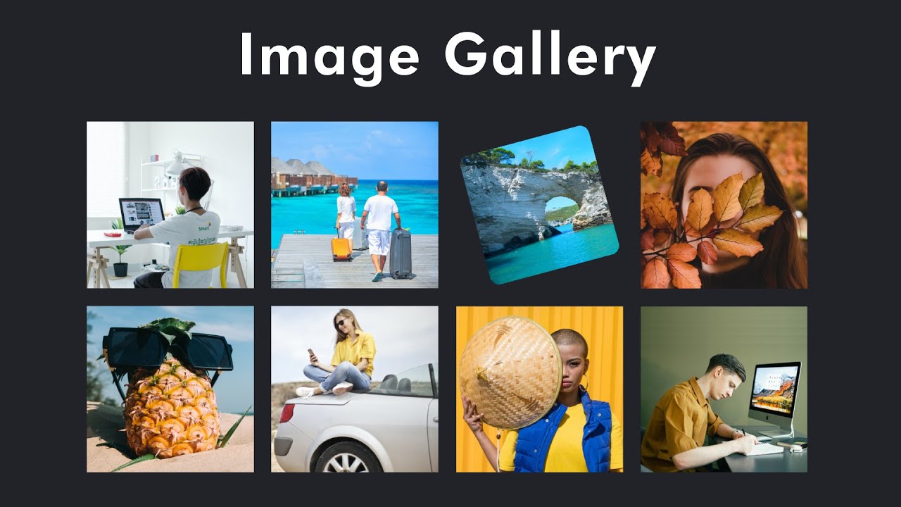
Do you want to show your pictures in an ordered, organized, and clean gallery without any tricky coding? So, here is some good news. Yes, you can create a clean and functional image gallery using a short code of HTML and CSS, and it will also work on all devices. No matter you are making a professional portfolio or just want to create a simple image gallery then this simple guide will help you a lot efficiently.
Step 1: Setting Up the HTML Structure
For this, first, you've to build a simple HTML structure. <div> tag will help you to hold your pictures, and each <img> tag shows a single picture.
<div class="gallery">
<img src="image1.jpg" alt="Image 1">
<img src="image2.jpg" alt="Image 2">
<img src="image3.jpg" alt="Image 3">
</div>
This simple code builds a basic HTML image gallery layout. As described above, <div> tag holds images, and <img> tag shows a single image. You can add as many pictures as you want by adding <img> tag per picture.
Step 2: Applying Basic CSS for Styling
So, you've built your HTML image gallery framework. Now, let's design it with some CSS properties. You can use a grid layout to arrange images in a neat and organized manner.
.gallery {
display: grid;
grid-template-columns: repeat(3, 1fr);
gap: 10px;
}
.gallery img {
width: 100%;
height: auto;
border-radius: 5px;
}
The above used grid-template-columns property divides the HTML structure into three equal-width columns, and the gap adds space between image sections. By using width: 100% your image will occupy all space of the column without expanding. The last one, the border-radius property, will round the corners of your image. By doing this, your image gallery will look appealing.
Step 3: Making the Gallery Responsive
After making a basic structure and designing your image gallery, now it's time to make it responsive. As you know, in today's modern age, 70% audience uses mobile phones more than laptops for internet surfing. We can do this using media queries that help HTML elements change their orientation according to different screen sizes.
@media (max-width: 768px) {
.gallery {
grid-template-columns: repeat(2, 1fr);
}
}
@media (max-width: 480px) {
.gallery {
grid-template-columns: 1fr;
}
}
With this structure, the gallery will show three pictures per row on bigger displays, two on tablets and one on phones. This makes the image gallery flexible and easy to use on any device.
Step 4: Adding Hover Effects for Interactivity
By adding a hover effect on all pictures, you can enhance the interaction of your gallery.
.gallery img:hover {
transform: scale(1.05);
transition: transform 0.3s ease;
}
This modest scaling will add interactivity and will slightly enlarge the picture when hovering over it. Your image gallery will become more user-friendly with this practice without overwhelming website style.
Conclusion
You saw above how simple it was to create a responsive and efficient image gallery with HTML and CSS without any tough programming. These two languages are perfect to use for beginners who want to setup their image gallery on websites. Moreover, you also learnt to make it responsive to work on all devices.
So, now it's your turn to try and experiment with code and add your own customization. Best of luck!
1.3k views
