October 09, 2024
Building a Responsive Navigation Bar with Only HTML and CSS
In today's world making a responsive website is a need not just a choice. You know the audience visiting your website can be using any type of device, either it could be tablet, phone, or laptop, what they want is smooth navigation as per their screen size.
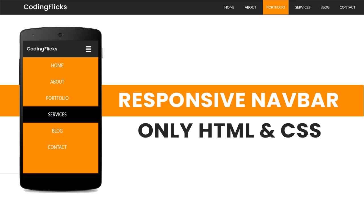
No worries, I'll guide you through all steps for creating a responsive and clean navigation bar that will be responsive to all screen sizes. And you want to know the fun fact? It's completely free of JavaScript, just HTML and CSS? Seems easy, right? Let's see below:
Step 1: Setting Up the HTML Structure
To start making s navigation bar first you've to built its simple and basic HTML structure. So, to make navigation easy and style the links, we'll use <nav>, <ul>, <li> elements.
<nav>
<ul>
<li><a href="#">Home</a></li>
<li><a href="#">About</a></li>
<li><a href="#">Services</a></li>
<li><a href="#">Contact</a></li>
</ul>
</nav>
Each list icon in above code reflects a different section of website and <a> tag helps to link visitors to other respective pages.
Step 2: Adding CSS for Basic Styling
So, you've created your basic HTML structure of navigation bar, now its time for some styling and designing. Styling a basic HTML navigation bar structure with CSS is like giving it a life. For styling we'll show list items in horizontal order and will add some padding and hover effect for an engaging and user-friendly experience.
nav ul {
list-style-type: none;
padding: 0;
display: flex;
}

nav ul li a {
text-decoration: none;
padding: 10px 20px;
display: block;
color: #333;
}

nav ul li a:hover {
background-color: #f0f0f0;
}
As discussed earlier, to align list items horizontally we used display: flex property. And hover effect makes your navigation bar interactive and user-friendly by highlighting the bar's menu items.
Step 3: Making the Navigation Bar Responsive
As we've made the basic structure and designing of navigation bar. In this step, we'll make this navigation bar responsive. By using CSS media queries, you can make your navigation bar compatible to multiple screen sizes. And for the screen size less than 768 pixels, the below code will switch bar's orientation to vertical.
@media (max-width: 768px) {
nav ul {
flex-direction: column;
align-items: center;
}

nav ul li a {
padding: 15px;
width: 100%;
text-align: center;
}
}
The above code uses flex-direction property to align list items vertically for smaller screens. And menu items also centered and stretched to fit the full screen size.
Step 4: Testing and Finalizing
After configuring the HTML and CSS, it's necessary to test the navigation bar on a variety of devices. Make any necessary adjustments by modeling various screen sizes using the browser's developer tools. Additionally, you can test on real mobile devices to make sure the navigation works properly and is completely responsive.
You can now further personalize your navigation bar by including a dropdown menu.
Conclusion
It's not as hard as it sounds to create a responsive navigation bar using simply HTML and CSS. You now know how to create a navigation bar that looks fantastic and smoothly changes to fit various devices by following these simple steps. You can keep making the design and functionality better with a little imagination, giving all of your visitors an easy time.
1.4k views
